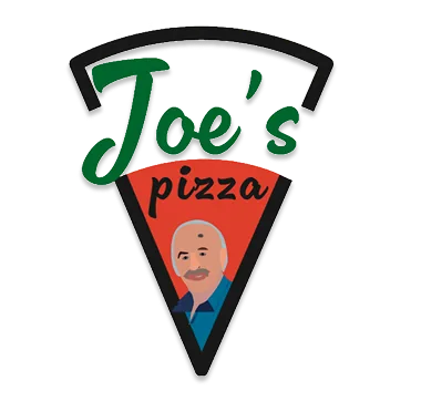
Joe’s Pizza
Brand strategy & branding
A branding project for a restaurant, creating a strong and recognisable visual identity that reflects a warm, welcoming and appetising world.
The project
Joe’s Pizza is a visual identity redesign aimed at modernising the image of an iconic New York pizzeria while preserving its authenticity and Italian heritage. The goal was to strengthen the brand's graphic coherence, set it apart from competitors and adapt its identity to the digital era while respecting its vintage, popular DNA.
The concept
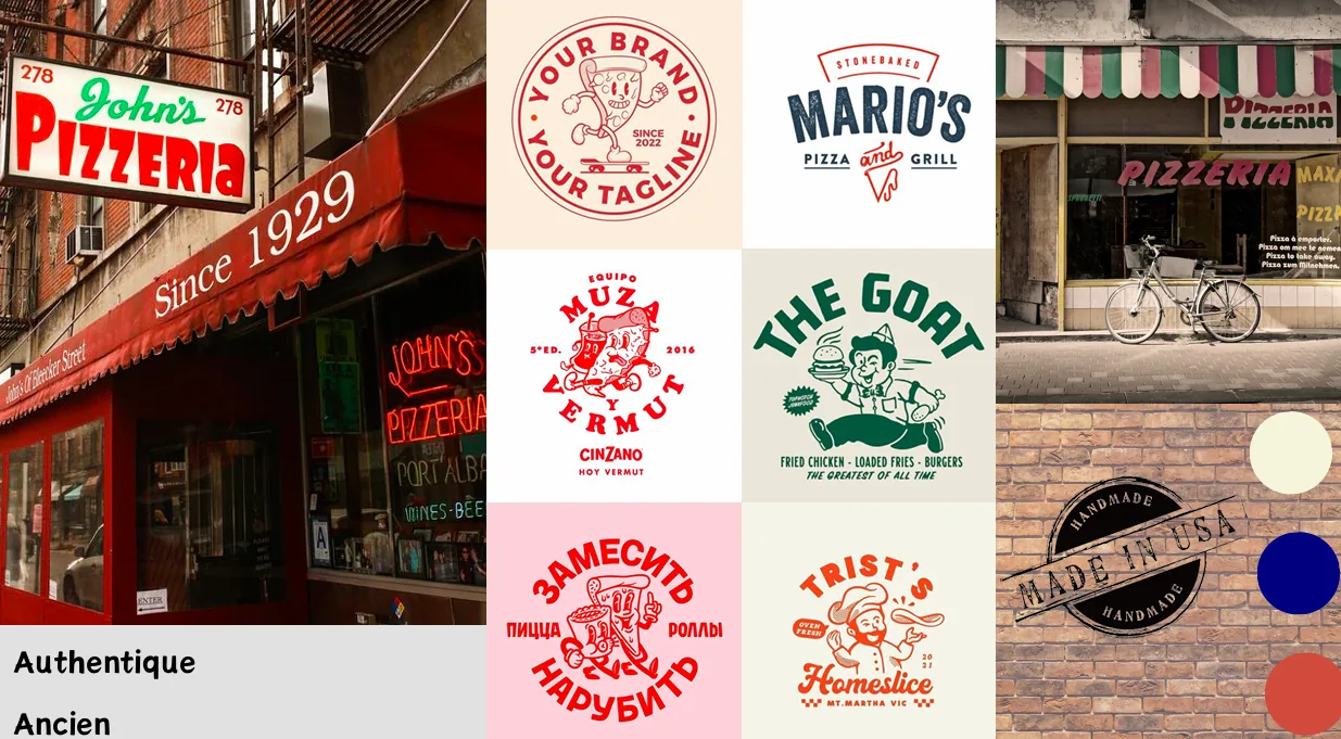
The concept balances three strong pillars: the brand's vintage heritage, the modernity its evolution demands, and the Italian identity at the origin of pizza. We chose to keep certain historic codes, notably the mascot, while simplifying and modernising the graphic composition. The identity revisits the Italian colours, adopts clearer and more consistent typography, and strengthens the pizza slice as the central symbol of the logo. The aim was to create a timeless identity capable of evoking nostalgia, authenticity and warmth.
Project visuals
Highlights
Competitive analysis and positioning strategy
A detailed benchmark analysing their communication, sales channels, graphic codes and digital presence. Defining a positioning built on authenticity, heritage and visual clarity.
Complete visual identity redesign
A new logo built on three defining elements: the vintage mascot, the iconic slice and the Italian tricolour. A brand book covering logo variations, the colour palette and the typographic choices.
Adapting the brand across physical and digital media
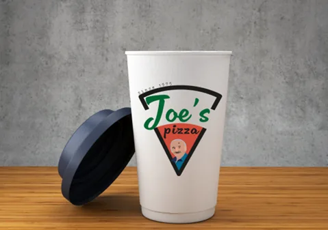
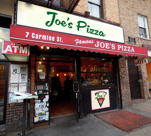
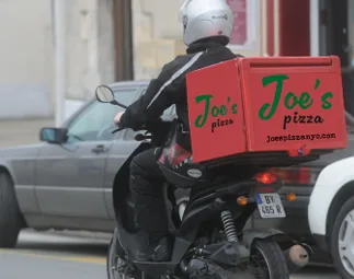
A range of tangible applications to project the brand: pizza box packaging, cups, aprons, shopfront signage, scooter deliveries and the in-store world.